1. Introduction
From ancient times when humans depicted survival strategies on cave walls to present times when people are ever busier and distracted in a number of activities, data visualization has been playing a pivotal role in displaying complex raw data into easily understandable visual graphics. Many disciplines consider data visualization equivalent to visual communication because it communicates information clearly and efficiently to the users via tables, charts, graphs, and plots. The purpose of data visualization is not only to gain insight but also to save time for the users of the data (Chen et al., 2014) . By utilizing data visualization tools, users can clean data, explore data structure, detect outliers and unusual groups, identify trends and clusters, spot local patterns, evaluate modeling output, and present results (Unwin, 2020) .
Businesses in today’s world need to process vast amounts of data generated daily. One of the essential tasks for most companies is to create financial statements such as income statements, balance sheets, owners’ equity statements, and cash flow statements. Public firms in the USA publish 10-K and proxy statements that share valuable information about firms, including financial positions and compensations of CEOs, non-CEO executives, and boards of directors. Financial analysts, stockholders, suppliers, banks, and insurance companies that provide loans to firms, asset managers, and other stakeholders utilize the publicly available information for investment purposes and various other decision-making processes.
However, deciphering information from 10-K and proxy statements is not easy, especially for shareholders, due to the amount of information and raw numbers these statements contain. For the common shareholders and regular non-users of financial statements, data visualization can provide an appealing and easily understandable story by transforming data into visual elements such as charts, graphs, and diagrams to help them gain actionable insights and make informed decisions promptly. So, while financial numbers, such as net income, EPS, ROE, etc., are important to analysts and businesses for various strategic decision-making processes, visualization is equally important for non-finance people to quickly analyze years of data and get a clear visual picture of any trend.
This study aims to show the importance of data visualization in Finance and discusses some examples of how data visualization tools can be utilized to convey financial insights to non-financial users. In doing so, we create dashboards, charts, and graphs from 10-K and proxy statements of Walmart. We especially show that non-financial users or stakeholders can visually determine how Walmart has performed in the last five years. From our analysis, we see that Walmart increased sales consistently from 2018 to 2023. Even though the pandemic affected the majority of businesses around the world during the 2020 to 2022 period, Walmart not only increased sales during these turmoil periods but also maintained a healthy profit margin throughout the five-year periods. On further analysis, we find that the company kept the long-term loan at a manageable percentage by building a strong assets base and by generating healthy cash flows from operations. It turns out that all these positive outcomes have been possible because the company pay structure to the CEOs, directors, and executives is highly sensitive to the performance of the firms. These top executives’ majority portion of the income is tied to the stock performance. The stock rewards of the executives have been growing because the company has been maintaining strong financial performance throughout the analysis period.
Even though the use of data visualization has been growing in all sectors, firms are not fully utilizing the data visualization tools extensively to publish 10-K and proxy statements. Despite the significance of the charts, graphs, and dashboards in conveying a firm’s financial health to the users, very few literature discusses the importance of these tools in publishing 10-K and proxy statements. We fill this research gap and contribute to the existing literature by showing that firms can convey the same financial stories to non-financial users by putting all numbers in charts and graphs, or dashboards. This practice will save time and attract more stakeholders to learn about a firm.
Our paper proceeds as follows. Section 2 discusses the importance of data visualization in finance. Section 3 reviews the relevant literature and shows the contribution of this study. Section 4 describes the methodology of this study. Section 5 provides proposals for companies publishing annual reports, and section 6 concludes.
2. Importance of Data Visualization in Finance
The importance of using visualization techniques has been growing in accounting and finance. For example, the Securities and Exchange Commission (SEC) encourages presenting information or data in graphical form to improve users’ understanding of financial disclosures. Complying with this requirement, companies have significantly increased the disclosure of qualitative and quantitative infographics in 10-Ks in recent years (Christensen et al., 2023) . The authors also find substantial variation across industries in firms’ choices regarding picture types, data content, and the placement of infographics within 10-Ks. Overall, they document that infographics have become a key element of corporate disclosure.
Visualization plays an important role in conveying the underlying story to the users of financial statements. Visualization of financial information is particularly important for insiders and stockholders for effective communication and collaboration and to close the gap between financial experts and non-experts. It enables the stakeholders to make data-driven decisions and detect risks or opportunities by displaying visual trends, correlations, and anomalies. It also allows users to make informed and real-time decisions in the dynamic business environment by presenting an interactive exploration of financial data. One of the vital tasks for managers and analysts in corporate finance is to accurately forecast and create visual models, scenarios, and simulations so that they can analyze future outcomes. Visualization helps decision-makers quickly identify potential risks and evaluate alternative strategies, thereby improving financial forecasts’ reliability and accuracy.
Risk management empowers companies with essential tools to identify and deal with potential internal and external financial risks so that they can take precautions to mitigate the risks. Even though systematic risks that affect the whole market cannot be eliminated, unsystematic or company-specific risks can be substantially reduced by properly handling potential threats and then developing structures to address them. Proper risk management enables firms to undertake calculative value-enhancing risks and increase confidence in the decision-making process. In this regard, data visualization techniques such as heatmaps and tree maps enable insiders to allocate resources according to the prioritized risk mitigation strategies by providing intuitive illustrations of risk exposure.
Financial institutions like banks and insurance companies use data visualization to identify risks associated with loan approval decisions. Portfolio managers use real-time dashboards to uncover portfolio risks and identify concentrated portfolios. For example, the portfolio can be used to get a holistic overview of factor data from a Risk-Factor level for a general market situation analysis, a Multiple-Portfolio level for understanding the portfolio strategies, and a Single-Portfolio level for investigating detailed operations (Yue et al., 2019) . Benchmarking data visualization is used to benchmark portfolios and compare their performance. We can compare today’s portfolio with a portfolio a year ago or more, compare our portfolio’s performance against the benchmark portfolio, and identify whether the interest rate increase or decrease affects the bond market. Benchmarking allows portfolio managers to understand the trends in a broader context and helps to respond accordingly.
Developing financial models is crucial to the success of the business decision-making process. For example, firms need to invest their capital in different projects to produce goods and services. Firms need to forecast future cash flows and compute the net present value (NPV) and internal rate of return (IRR) to identify profitable and value-enhancing projects. NPV tells whether the project is value-enhancing, and IRR shows a project’s internal rate of return. The cost of capital plays an important role between the NPV and IRR. When the cost of capital is less than IRR, NPV becomes positive. It means the firm is generating more profit than the cost. However, if IRR is less than the cost of capital, the project cannot even recoup the costs. All this information is easily understandable to a finance person, but to a non-financial person, this information is mind blogging. In this regard, the NPV profile can be convenient for visualizing this information and making quick decisions, even for a non-financial person.
For example, the NPV profile in Figure 1 shows that the crossover (IRR) rate is around 13.7%. It means that if the project’s discount rate or the project cost of capital is less than 13.7%, the net present value or NPV is positive. In other words, by accepting the project at a cost lower than 13.7%, the firm will be able to generate positive value. The lower the cost, the more positive the value. Here, it is important to note that 13.7% is the IRR value at which the firm does not make or lose money because the cost equals the return the project generates. If the actual project cost is more than 13.7%, we can see that the firm is losing value.
Technical analysis of the stock is heavily dependent on data visualization. Technical analysis tools are applied to charts so that traders can identify entry and exit points for potential trades. For example, the daily stock trading trend shows the ups and downs of stock during trading hours. Analyzing this trend, Chan et al. (1995) find that spreads in NASDAQ are narrow during the final 30 minutes of trading, whereas spreads in NYSE are widest at both the open and the close. They also find that the spread in NASDAQ is stable during most of the
trading day whereas it declines rapidly during the first hour of trading in NYSE. Besides, chart patterns are used to identify areas of support and resistance so that traders can predict the direction of price. For example, ascending triangle charts indicate resistance areas. Moreover, traders use moving average convergence divergence (MACD) to get an idea about the interplay between several moving averages.
Data visualization can be applied to financial reporting to detect and prevent fraud. Suspicious transactions can quickly be flagged in real-time with the help of data visualization software. Companies and customers can save huge potential losses by acting quickly on the identified fraud through data visualization tools. Besides, it is important for any firm to pinpoint areas of improvement by analyzing the different business segments. Top management, such as C-suite employees, usually oversees segment performance. Data visualization assists these managers in integrating and visualizing data from multiple units so that they can get a complete picture of the business, pinpoint areas to improve, take necessary actions before it is too late, and contribute to improved firm performance.
3. Literature Review
Even though there has been much research on the impact of data visualization on different disciplines, research on the relationship between data visualization and finance or corporate finance has been limited. Volmer (1992) examines the benefits of visualizing and reports on an experiment on the significance of visual information designed to compare visual and numerical financial information. He tried to identify whether visual information could contribute to a better insight into the financial properties of the firm over five years. The author finds from his experiment that the graphical presentation of information saves time compared to numerical information only.
Schulz & Booth (1995) find graphs may be helpful in income statement-related analytical review procedures in improving audit efficiency without sacrificing audit effectiveness. Dull & Tegarden (1999) investigated the relationship between two-dimensional three dimensional, fixed, and three-dimensional rotatable data and the subject’s ability to make predictions based on financial data. They find that complex multidimensional data increases decision-making and prediction accuracy because it facilitates the direct examination of the complex relationship in financial data. Similarly, Butavicius & Lee (2007) found that a well-structured visualization could create a well-statical advantage. Beattie & Jones (1997) concluded that the graphs enhance the potential to communicate rather than merely to report financial information and present an aspect of corporate financial reporting which previously has not been explored in a cross-sectional context.
Recent technological advancement helps researchers and practitioners explore data visualization more sophisticatedly. For example, Chakri et al. (2023) have recently used exploratory data analysis to analyze financial accounting data, including balance sheets, income statements, and cash flow statement data. Using machine learning technology, they predict total revenue against various parameters, such as the Debt-to-Equity Ratio, Current Ratio, Return on Capital Employed, Net Profit Margin, and Inventory Turnover Ratio, to determine profitability for investment decisions. Their findings show that the decision tree is the most valuable model for performance analytics. Arleo et al. (2023) use Sabrina 2.0, a Visual Analytics (VA) approach for exploring financial data across different scales, from individual firms to nationwide aggregate data. Their analysis shows how Sabrina 2.0 enables the generation of insights and how incorporating transaction model assists users in exploring a national economy.
Utilizing the novel design architecture of the proposed IoT-based Efficient Data Visualization Framework (IoT-EDVF), Shao et al. (2022) analyze multiple data sources and data quality management for business intelligence in corporate finance. They implemented financial risk analysis to improve data quality management. They showed that their proposed framework is more reliable because the statistical outcomes of their simulation analysis show that the performance increased with a lower delay response of 5 ms, and revenue analysis improved with the improvement of 29.42% over existing models.
To show the importance of graphics to nonprofessional investors, Brown et al. (2022) showed that these investors in social media platforms depend more on non-GAAP earnings displayed with an eye-catching stock photo, regardless of the textual prominence of GAAP or non-GAAP earnings. In a more recent study, Nekrasov et al. (2022) examined tweets containing any still image or video, including illustrative tweets containing graphics, executive photos, company logos, and stock photos. The authors document that firms experience a subsequent increase in retweets and abnormal Google search volume when they include a visual in their earnings announcement on Twitter. Similarly, Asay et al. (2018) find that including a CEO’s photo in an earnings release magnifies the reaction to both good and bad news. However, these photos are unlikely to have the same effect in 10-K because the CEO’s presence is inherently less salient in 10-K.
The literature review shows that very few studies discuss how data visualization tools can be utilized by firms in publishing their financial statements, such as 10-K and proxy statements. These statements are very critical to the shareholders and creditors as they contain financial information of firms. However, this information is not easily understood by many users. This study fills the research gap by showing that firms should use more graphs, charts, and dashboards to tell financial stories to non-financial users. The use of these tools not only shows the overall picture of the firm but also saves a huge amount of time.
4. Methodology
To show how data visualization tools can be utilized to describe financial information from 10-K and proxy statements, we use Walmart’s 10-K and proxy statements. We collect these statements from Walmart website for the period of 2018 to 2023. We also used simplified statements from Stock-analysis-on.net. We analyze income statements, balance sheets, and cash flow statements. From proxy statements, we collect salary and compensation information for CEOs, top non-CEO executives, and the board of directors. We then create dashboards using Tableau and charts and graphs using Microsoft Excel. For the ratio analysis, we divide major income statement line items such as cost of goods sold, gross profit, operating profit, net profit, and SG&A by net sales. We also divide major line items from the balance sheet by total assets to compute the ratios.
5. Proposals for Companies Publishing Annual Reports
In this section, we focus on what needs to be done more frequently in the future to tell financial stories to nonprofessional financial information users. We have analyzed the most salient items from Walmart’s annual reports to support the idea of more visual graphs and charts in financial reports. While analyzing statements, we focus on the line items related to the firm’s value, short-term and long-term financial health indicators, compensation of the executives, and percentage of shareholding by the owners (shareholders) of Walmart.
Figure 2 shows a snapshot of the most important line items of Walmart’s income statement for the fiscal year 2018 to 2023. The chart shows that the income statement items include Net sales, Cost of sales, Gross Profit, Selling, General, and Administrative Expenses (SG&A), Operating income, and Net income. The net sales show an upward shift in the income statement from $500,000 to $590,000. The cost of sales also indicates an increase in the income statement from $380,000 to $430,000. We can see that the gap between sales and cost
![]()
Figure 2. Key line items of the income statement of Walmart from 2018 to 2023.
remains fairly the same throughout these five years, indicating that the company maintained roughly the same percentage of the cost of sales. Even though we seea constant gap between sales and cost of sales throughout this analysis period, we can see that the gap between gross profit and cost of sales has widened in recent years. It means that the company may have increased some other costs in 2023. Upon a closer look at the selling, general, and administrative (SG&A) expenses, we find that SG&A expenses increased in 2023. Operating income depicts a stable trend from 2018 to 2022, with a slight decrease in 2023, probably due to increased SG&A expenses in 2023. And finally, the net income increased in 2019 and continued even during the pandemic. However, as in operating income, we see a slight decrease in net come in 2023 even though sales increased in that year. Overall, Walmart has been doing great in terms of maintaining a constant profit. Even though their sales have increased in recent years, it does not directly translate to net profit due to the increase in cost, an area for future improvements.
In the previous analysis, we focused on the actual amounts rather than ratios. Though numbers can give us some idea, ratios are better indicators of firm performance because ratios are scaled numbers. Figure 3 presents the ratio analysis of the cost and income of Walmart from 2018 to 2023. As shown in the chart, costs to sales ratio is constant from 2018 to 2023 at a slightly less 80% level. SG&A expenses (22% of sales) do not change from 2018 to 2023. From 2018 to 2023, Gross Profit Margin showed any significant increase or decrease in sales. It only has a fixed rate of approximately 26% of sales throughout the years. The operating profit margin shows a slight movement of increase from 2021 to 2022 and diminishes from 2022 to 2023. It had a sales rate of approximately 3% from 2018 through 2021, then increased from 3% to 4% and eventually declines back to 3% in 2023. The net profit margin shows a significant increase from 2019 to 2020, attaining a maximum with a constant sales rate of approximately 2%.
Understanding the financial position and short-term capital management is key to the long-term success of a firm. Figure 4 represents a dashboard of the long-term financial position and working capital management of Walmart. We
![]()
Figure 3. Profit margin of Walmart from 2018 to 2023.
![]()
Figure 4. Long-term financial position and short-term working capital management of Walmart from 2018 to 2023.
can see that the company maintained a low level of long-term debt and more property and equipment to help finance the long-term debt. The company’s long-term assets are sufficient to finance total liabilities in case of liquidation or any financial crisis. Overall, Walmart’s total assets are sufficient to use as collateral when any long-term financing is required. The financial ratios also show a similar trend throughout the five-year period.
The long-term success of a firm also largely depends on short-term efficient management of capital. Now, we turn our focus on the short-term capital management of Walmart, especially working capital management. Figure 4 shows that firms hold almost similar amounts of cash to accounts payable, a good strategy to keep the supplies satisfied to do business with. Short-term borrowings are also at a manageable level for a large firm like Walmart. Compared to the volume of sales, inventories and receivables are at a manageable level, another positive sign for the firm. Overall, even though the firm needs some cash every year to fund the deficit in working capital (very usual in almost all businesses), it is doing a great job in managing short-term liabilities.
The most important analysis for a firm is the cash flow analysis. It does not matter how much profit a firm generates; unless the profit is not converted into cash, the firm needs to worry about long-term growth prospects and, in some cases, about survival. From Figure 5, we can see that Walmart generates healthy amounts of cash flow every year from its operating activities. Almost throughout the five years, the cash inflow from operations is high enough, with some fluctuations in 2020 and 2022, to cover the funding for investment activities and to repay the loans for financing activities. The company needed more cash in 2019 to finance investment, which they could manage easily by generating more cash
![]()
Figure 5. Cash flow activities and sources and uses of cash by type of activities of Walmart from 2018 to 2023.
from operations. In Figure 4, we noticed that the firm increased short-term borrowings in 2021 and 2022, for which it had to repay more loans in those years. Overall, the firm’s cash flow activities are healthy.
Next, Figure 5 also shows the details of sources and uses of the cash throughout the fiscal years from 2018 to 2023. For simplicity, we use only the major line items. The complete cash flow statement is in Appendix A, which shows many numbers that are not easily understandable by most users because of a lot of numbers. However, when we use the Tableau dashboard for main line items, we can see that Walmart receives cash mainly from net income, depreciation, and by issuing long-term debt. Most cash outflow occurs in purchasing property and equipment, acquiring firms, repaying long-term loans, paying dividends, and repurchasing common stock. None of these shows wasteful expenditure and well management of cash flow activities. The company consistently pays dividends and invests in assets, a good sign for shareholders.
Analyzing the financial statements, we can see that Walmart is doing great in terms of generating consistent profit, creating assets for the firm, managing short and long-term capital, and generating healthy cash flow each year. Now it is time to focus on whether executives and CEOs are shirking. Figure 6 shows
![]()
Figure 6. Executives’ compensation comparison of Walmart from 2020 to2023.
the compensation comparisons of Walmart and segment CEOs and executives for the years 2020 to 2023. The executives are the CEO, CFO, GTO, CEO-U.S., CEO-Walmart International, and CEO-Sam’s Club. Upon analysis, it can be observed that there are no significant differences among the various CEOs based on their respective locations. For example, the general CEO, Sam’s Club U.S. CEO, and International CEO have exhibited similar compensation trends over the years. There is no significant difference between them in terms of compensation. However, the CEO of Walmart U.S. stands out with a slight disparity, particularly in 2020 and 2022, due to his managing a large firm. Notably, there is a considerable contrast between the compensation of the Chief Financial Officer (CFO) and the Global Chief Technology and Development Officer (GTO). The GTO generally receives higher compensation than the CFO, although only sometimes yearly.
We focus on compensation and shareholding because this is directly related to shareholders’ wealth maximization goal. If we focus on Figure 7, we can see that every year for all executives and CEOs, a major part of the compensation is the stock rewards, which is good for the shareholders as these executives will serve for the sake of the shareholders’ wealth maximization for the love of their own shareholding in the company. Figure 8 shows that the directors hold 46.92% of outstanding shares. Altogether 47.06% of the company shares are held by the insiders. This is an extremely positive sign for Walmart shareholders because these
![]()
Figure 7. Executives’ compensation breakdown of Walmart from 2020 to 2022.
![]()
Figure 8. Percentage of outstanding shares held by the shareholders for the fiscal year 2023.
insiders will do their best to improve firm performance for their own sake. These findings show evidence that compensation structure is tied to the firm’s performance. In fact, Walmart makes it clear in its proxy statement that almost 73% of the compensation of executives and CEOs is tied to the firm’s performance. This type of compensation structure reduces the risk of the CEO becoming excessively powerful. Literature shows that CEO’s excessive power reduces investment efficiency (Chowdhury et al., 2023) .
6. Conclusion
Graphs and charts or other visual tools are extremely useful for telling stories to the audience and readers. However, these tools are less intensively used in the finance world than in other sectors. In finance, professionals and academicians mainly depend on numbers and ratios. Even the annual reports published each year by firms are mostly full of text and numbers. However, nonprofessional investors or even many professionals, including insiders, do not easily get a clear picture from numbers quickly. Analysts need to spend much time understanding a firm’s underlying strengths or weaknesses by analyzing statements. However, analysis is not possible for many stakeholders as this requires specific analysis skills. So, data visualization can be very useful in telling the story of a firm to nonprofessionals to get a clear picture within a short time easily. Here, our goal is to show what firms should be doing more while publishing their annual reports. Of course, they will publish detailed text and numbers, but they should also report more visual graphs and charts so that nonprofessional stakeholders can get a better idea about the firm’s performance. In this essay, we have analyzed Walmart’s financial statements and compensation structure (available in proxy statements). We try to show the importance of visual graphs and charts by showing that we can easily get a clear view of a firm even by visualizing important aspects of financial statements.
Unlike analyzing numbers and tables like a financial analyst, analyzing graphs and charts of Walmart, we find that the company has been doing great in the last five years. It has been generating consistent profit for the shareholders, paying dividends, growing assets, increasing sales, managing short- and long-term assets and liabilities nicely, and generating healthy cash flows every year for the long-term success of the firm. It seems that all have been possible due to the insiders holding a large part of the ownership of the firm. Also, the compensation structure of top executives and CEOs is tied to the firm’s performance, enabling the firm to perform well. These findings show the importance of using graphs and charts more frequently along with financial statements so that nonprofessionals can see a firm’s financial strengths and weaknesses and make investment decisions.
One of the limitations of this study is that we did not compare the financial statements of one firm with those of the other. Future research can compare financial statements of different firms using visualizations tools so that shareholders and non-financial users can compare different company performances by just looking at graphs and charts. One of the reasons why companies use these tools less frequently could be less use of financial statements by nonfinancial users in the past. However, in recent years people have been busier than ever, and there has been tremendous growth in investments in the stock market by small individual investors. In light of these changes, it is commended that companies use more visualization tools in publishing financial statements so that non-financial users can easily decipher the meaning of these statements in a short time and can make investment decisions. Also, the Securities and Exchange Commission (SEC) can create rules and regulations for firms to use more visual tools in generating financial statements.
Appendix A
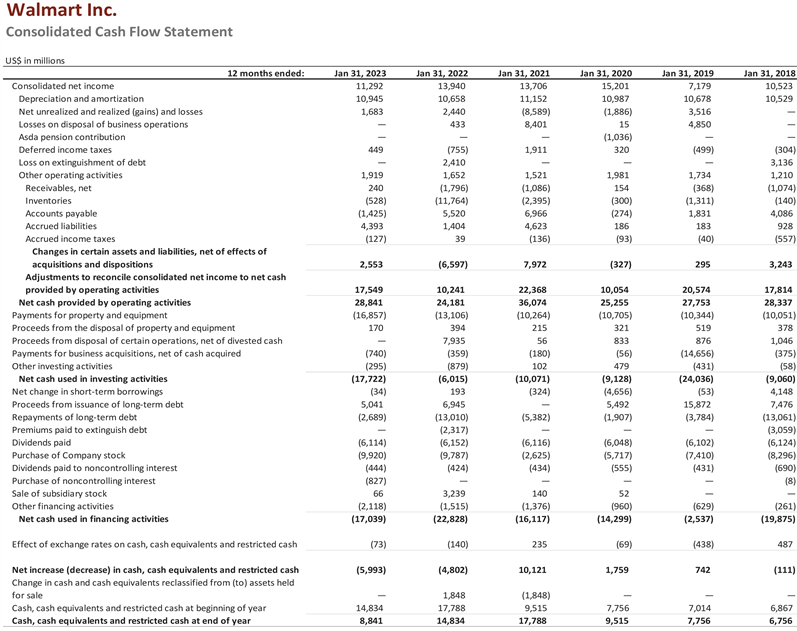
Source: https://www.stock-analysis-on.net/NYSE/Company/Walmart-Inc/Financial-Statement/Statement-of-Cash-Flows.